- Sage Case Study -
Client: Sage Wellness and Bodywork
Role: Solo Designer
Project type: Brand & Web
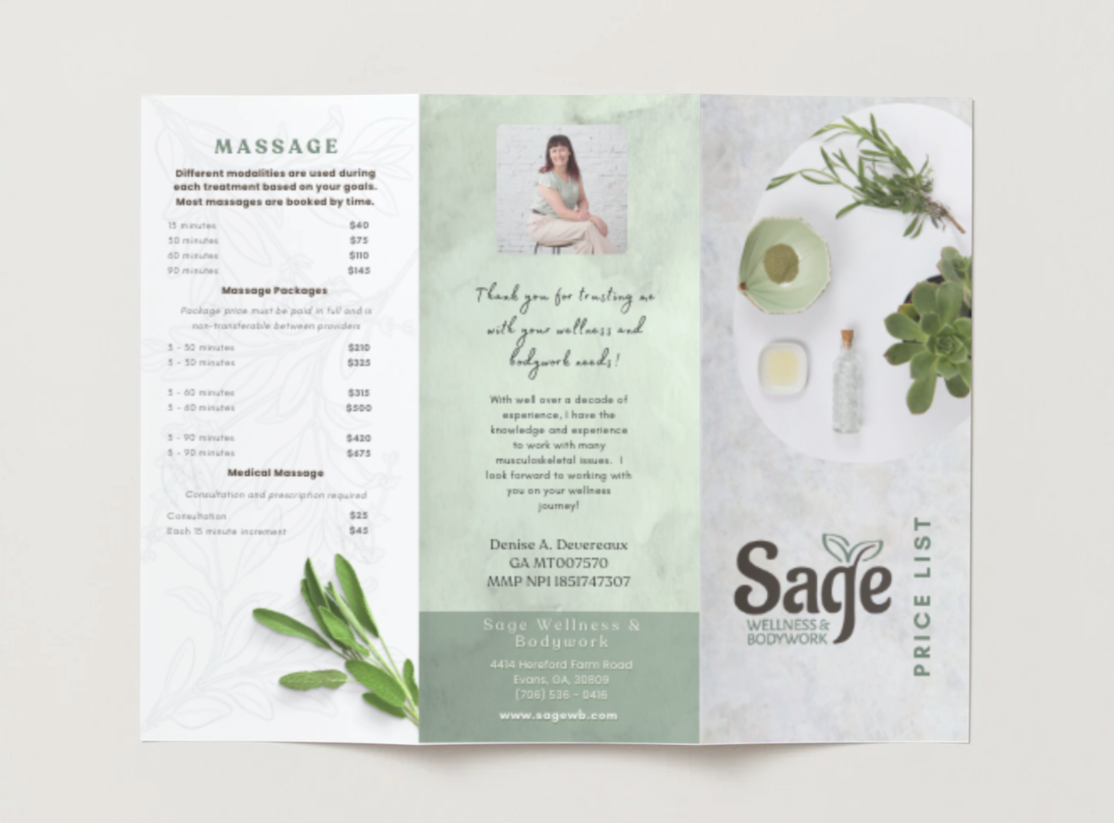
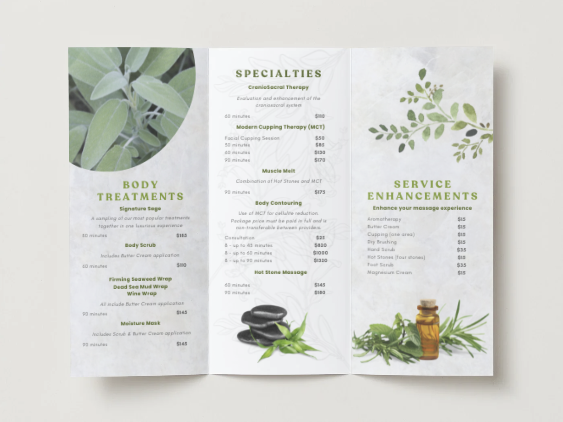
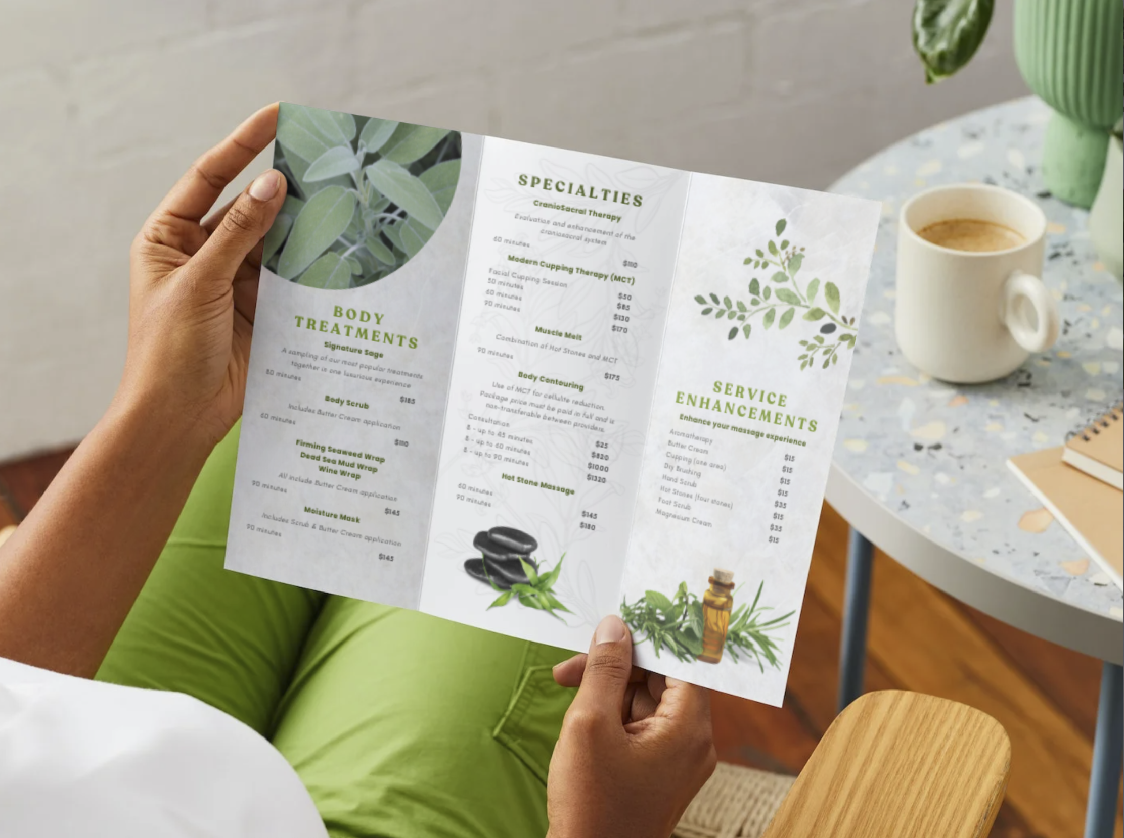
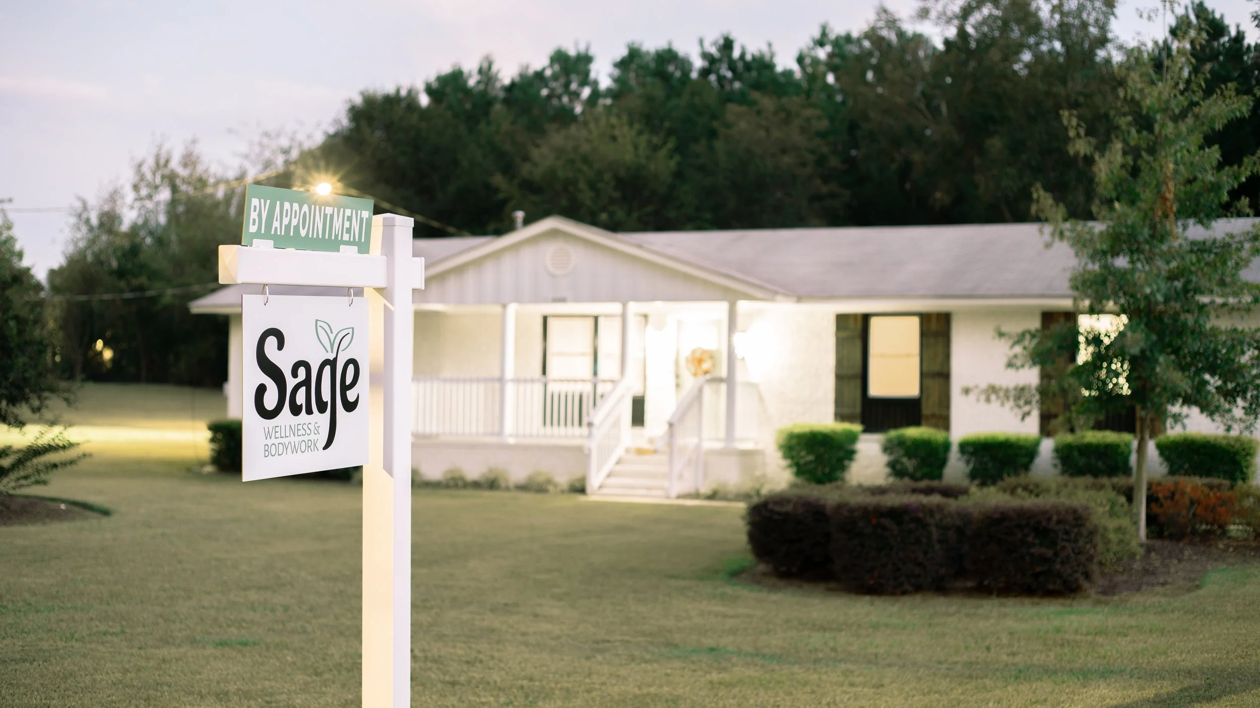
Branding and web design for an Evans, GA spa and wellness clinic. I handled the branding, web design, photography, and brochure design over the course of a year as the business developed. Go to the active website.
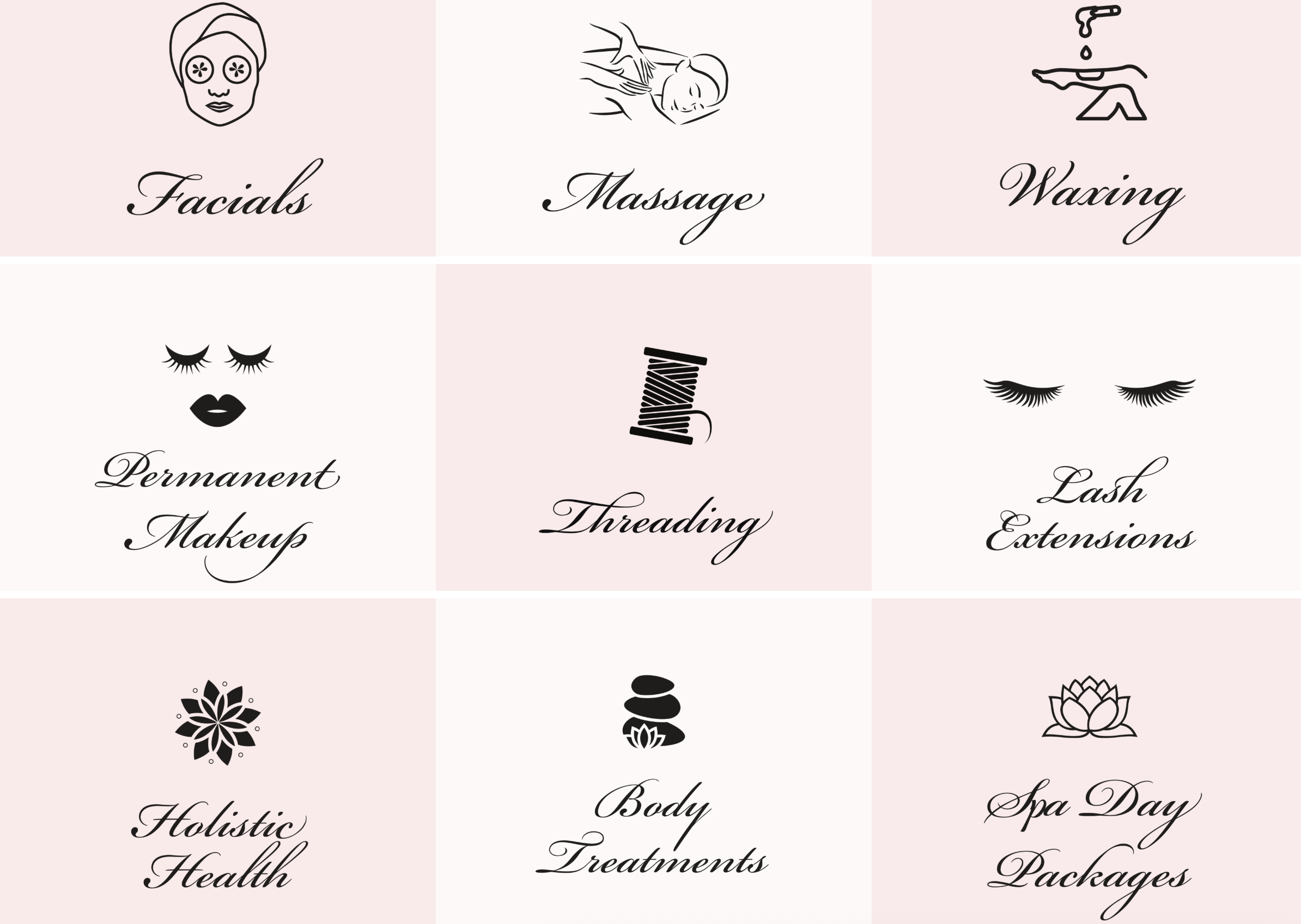
Image 1: competitor
The spa needed a brand for its first location that felt welcoming and fun while standing out from cluttered competitors with a cleaner, calmer design.

Image 2: Sketch
“The Sage Approach to Wellness”

Typography
The logo pairs Aladdin with Alegreya Sans SC. Aladdin’s flowing letterforms introduce warmth and natural movement, reflecting the organic and holistic side of the spa. Alegreya Sans Small Caps provides structure and refinement, helping position the brand as both professional and high-end.
Color Palette
The spa offers a wide range of services, from energy work such as reiki to more clinical treatments like medical massage. Because of this range, a lighter and more muted palette felt appropriate. Soft greens and neutrals communicate calm and wellness while maintaining a clean, professional tone that works for both holistic and therapeutic services.
Website Design
Early website concepts experimented with large image blocks that included overlaid text for the service buttons. While visually striking, this approach made both the imagery and the service information harder to read. The final design instead focuses on clarity and usability. Services are organized into short, easy-to-scan categories with direct links, while imagery is presented separately so clients can explore the spa’s atmosphere without competing with navigation.